Color Accessibility
This tutorial introduces how to make Charts in QuorumColor Accessibility on Charts
Accessible features include discriminable color palettes in order to provide better contrasting visualizations as well as screen reader enabling. Contrasting choices were developed through using the Colorgorical palette picker noting that the chosen colors compare to current industry standards by balancing the importance of discriminability and aesthetic preference [1]. Other colors can also be manipulated by user preference such as converting colors to grayscale, negatives, warm tones, or cool tones as well. This small example will feature code on constructing color palettes for a bar chart. By default, the palette on the charts is based off of the Colorgorical palette. We can view how colorgorical works here.
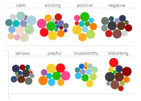
Other color palettes we considered were based off of the application between perceptual color properties (hue, chroma and lightness), palette composition (hue clusters, color frequency) and certain types of affect [2]. From this, the additional palettes were based off of eight affects, where four of them are core affects: Calm, Exciting, Positive, and Negative and four pragmatic affects: Serious, Playful, Trustworthy, and Disturbing. These affects relate the emotions users feel in relation to these palettes in order to have meaningful colors in data representations. Calm, Playful, and Positive palettes are in the lightest scales and most saturated while Serious, Disturbing, and Negative palettes are in the darkest scales and have more muted tones. Trustworthy palettes have more blue-green hues with a yellow to link, while Exciting had a similar palette, but more strongly saturated. The imporant aspect of this is learning how to give meaning to the colors we choose when creating our charts. These color palettes are focus more on the emotional design on viewers while maintaining discriminable palettes, similar to Colorgorical.
To change the color we can simply call a function such as SetColorPaletteToColorgorical() from our chart component which is a color palette that focuses on making distinguishable color palettes, providing accessibility for visually impaired viewers. Other color palettes we are able to choose from are as follows:
SetColorPaletteToColorgorical()
SetColorPaletteToCalm()
SetColorPaletteToCoolScale()
SetColorPaletteToWarmScale()
SetColorPaletteToDisturbing()
SetColorPaletteToExciting()
SetColorPaletteToMagma()
SetColorPaletteToNegative()
SetColorPaletteToPlayful()
SetColorPaletteToPositive()
SetColorPaletteToSerious()
SetColorPaletteToTrustworthy()
SetCurrentPaletteToGrayScale() // This one applies a grayscale filter to whichever other palette is currently being used.
SetColorPalette(Color A)
SetColorPalette(Color A, Color B)
SetColorPalette(Color A, Color B, Color C)
SetColorPalette(Array colors)
Here is example code of using the palettes which can be run on Quorum Studios:
BarChart chart = frame:BarChart()
chart:SetColorPaletteToCalm() // will create a softer and cooler color palette
chart:SetColorPaletteToColorgorical() // uses the constructed color palettes references by article
chart:SetColorPaletteToExciting() // will create a bright and vibrant color palette
Color palettes can be manipulated by the user to best fit contrast levels in relation to the data. Below we will have examples on what each color palette looks like.
Try it Yourself: Colorgorical Palette
Press the blue run button to execute the code in the code editor. Press the red stop button to end the program. Your program will work when the console outputs "Build Successful!"
SetColorPaletteToColorgorical()Try it Yourself: Cool Palette
Press the blue run button to execute the code in the code editor. Press the red stop button to end the program. Your program will work when the console outputs "Build Successful!"
SetColorPaletteToCoolScale()Try it Yourself: Warm Palette
Press the blue run button to execute the code in the code editor. Press the red stop button to end the program. Your program will work when the console outputs "Build Successful!"
SetColorPaletteToWarmScale()Try it Yourself: Disturbing Palette
Press the blue run button to execute the code in the code editor. Press the red stop button to end the program. Your program will work when the console outputs "Build Successful!"
SetColorPaletteToDisturbing()Try it Yourself: Exciting Palette
Press the blue run button to execute the code in the code editor. Press the red stop button to end the program. Your program will work when the console outputs "Build Successful!"
SetColorPaletteToExciting()Try it Yourself: Magma Palette
Press the blue run button to execute the code in the code editor. Press the red stop button to end the program. Your program will work when the console outputs "Build Successful!"
SetColorPaletteToMagma()Try it Yourself: Negative Palette
Press the blue run button to execute the code in the code editor. Press the red stop button to end the program. Your program will work when the console outputs "Build Successful!"
SetColorPaletteToNegative()Try it Yourself: Playful Palette
Press the blue run button to execute the code in the code editor. Press the red stop button to end the program. Your program will work when the console outputs "Build Successful!"
SetColorPaletteToPlayful()Try it Yourself: Positive Palette
Press the blue run button to execute the code in the code editor. Press the red stop button to end the program. Your program will work when the console outputs "Build Successful!"
SetColorPaletteToPositive()Try it Yourself: Serious Palette
Press the blue run button to execute the code in the code editor. Press the red stop button to end the program. Your program will work when the console outputs "Build Successful!"
SetColorPaletteToSerious()Try it Yourself: Trustworthy Palette
Press the blue run button to execute the code in the code editor. Press the red stop button to end the program. Your program will work when the console outputs "Build Successful!"
SetColorPaletteToTrustworthy()Test out the different types of colors with the data being presented. Note that this chart may not fit the format of what to consider with making good charts.
References
[1]: Gramazio CC, Laidlaw DH, Schloss KB. Colorgorical: Creating discriminable and preferable color palettes for information visualization. IEEE Trans Vis Comput Graph. 2017 Jan;23(1):521-530. doi: 10.1109/TVCG.2016.2598918. PMID: 27875168. https://ieeexplore.ieee.org/document/7539386.
[2]: Lyn Bartram, Abhisekh Patra, and Maureen Stone. 2017. Affective Color in Visualization. In Proceedings of the 2017 CHI Conference on Human Factors in Computing Systems (CHI '17). Association for Computing Machinery, New York, NY, USA, 1364 1374. DOI: https://doi.org/10.1145/3025453.3026041.
Next Tutorial
In the next tutorial, we will discuss accessible navigation, which describes how to use keyboard navigation and screen reader with charts.