Tutorial: TextBox
This tutorial tells you how to use TextBoxes in QuorumAn Introduction to TextBoxes in Quorum
In this tutorial, we will learn how to use TextBoxes in the Quorum Game Engine. Textboxes are a simple interface tool that allows users to interact with it by typing text into it. TextBoxes also allow us to manipulate and use the text inside it.
There is also another interface component that allows the user to input text and that is the TextField. A TextField is similar to a TextBox, but it only allows for input in a single line. More information on the TextField is provided at the end of this tutorial.
For this tutorial, we will create a project with two TextBoxes, and provide Buttons that allow the user to transfer text from one TextBox to the other, a Button to clear the receiving TextBox, and a Button to read aloud from the receiving TextBox. To start, create a new Game Application project.
Creating TextBoxes
For this main class, we will need the TextBox, Button, ManualLayout, and Color libraries. We need the ManualLayout library because the game needs a set layout for the textbox to render to the screen, giving us the following use statements:
use Libraries.Interface.Controls.TextBox
use Libraries.Interface.Controls.Button
use Libraries.Interface.Layouts.ManualLayout
use Libraries.Game.Graphics.Color
Since we want the TextBoxes and Buttons to be usable as soon as the game begins, all of our additional code in the main class will be in the CreateGame action.
For this main class, we need to make a Manual Layout variable and set the game's layout to it. We then need a Color variable since we will be using color to differentiate between the two textboxes. This gives us the following lines of code:
ManualLayout layout
SetLayout(layout)
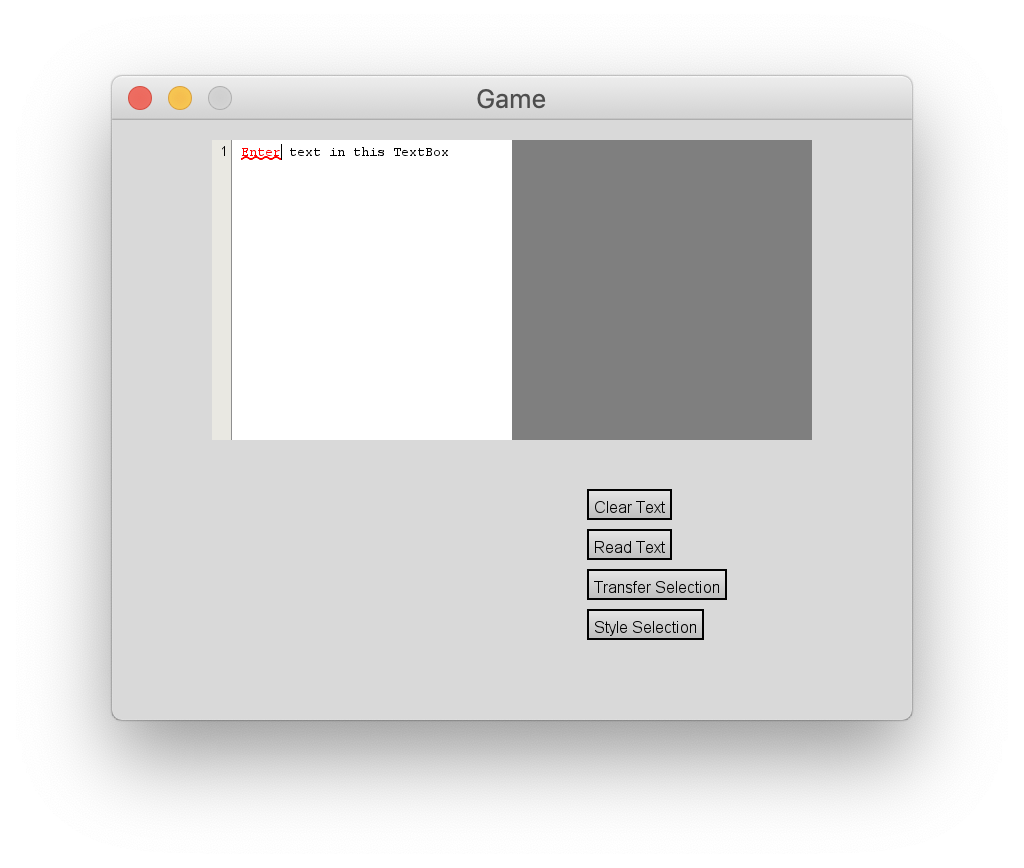
Color colorFirst, we will create a TextBox and add it to the game. We need to set the TextBox's size, background color, text, and position, this is done by using its respective Set functions. Then we add it to the game, giving us the following lines of code:
TextBox box1

box1:SetSize(300, 300)
box1:SetBackgroundColor(color:White())
box1:SetText("Enter text in this TextBox")
box1:SetPosition(100, 280)
Add(box1)
Now, let's create our second TextBox. To distinguish it from the first, we will make this TextBox gray, and will not preset text in it. We will also place it to the right of the first TextBox. This is done with the following lines of code:
TextBox box2

box2:SetSize(300, 300)
box2:SetBackgroundColor(color:Gray())
box2:SetPosition(400, 280)
Add(box2)
Accessibility
Normally when working with Focus you press Tab and Shift+Tab to move Focus around but a TextBox uses those keys for indenting text. As our example is now you will not be able to switch Focus from a TextBox. To change this you could either add another keybinding that will switch focus, or you set the TextBox to no longer use Tab for indenting. For our example we will do the latter and use Tab for Focus switching only. We will also change the TextBoxes’ names and make a small focus cycle so you can switch between both TextBoxes with only the keyboard. This can be done with the following lines of code:
box1:SetName("Left Textbox")
box2:SetName("Right Textbox")

box1:SetMoveFocusOnTab(true)
box2:SetMoveFocusOnTab(true)

box1:SetNextFocus(box2)
box1:SetPreviousFocus(box2)
box2:SetNextFocus(box1)
box2:SetPreviousFocus(box1)
We will be adding Buttons to this project so they will be included in the focus cycle as they are added. The final focus cycle will be given later in this tutorial.
If we build and run the project, we have the two TextBoxes and can type into either. By default, a TextBox can perform certain edit actions, such as copy and paste, with the default keys for your machine. You can copy, paste, select all, undo, and redo.
Adding More Functionality
Now that we have our TextBoxes, we can add more functionality to them by creating Buttons to clear and read the text in the second box. The TextBox has actions for adding, appending, and inserting text, to name a few, but for this tutorial we will focus on emptying, setting, and getting the text of a TextBox.
First, we will create a Behavior for each Button, creating a new Quorum class for each. We will name these "ClearBehavior.quorum," and "SayBehavior.quorum."
The ClearBehavior class is a Behavior that uses one TextBox, so we will need the libraries for TextBox, Behavior, and BehaviorEvent. We will create a TextBox class variable, which is undefined. Thus, we have an action to set the TextBox to the one in our main class. This class will use the Empty action, which clears the TextBox of any pre-existing text. The class is as follows:
use Libraries.Interface.Controls.TextBox
use Libraries.Interface.Behaviors.Behavior
use Libraries.Interface.Events.BehaviorEvent

class ClearBehavior is Behavior

    TextBox box = undefined

    action SetTextBoxes(TextBox sourceBox)
        box = sourceBox
    end

    action Run(BehaviorEvent behavior)
        if box not= undefined
            box:Empty()
        end
    end
end
The SayBehavior class similarly needs the TextBox, Behavior, and BehaviorEvent libraries, as well as the Speech library. The SetTextBoxes action is identical to the same action in the ClearBehavior class. In its Run action, we will create a Speech object and call the Say action. For the text parameter, we will use the TextBox's GetText action. The complete SayBehavior class is as follows:
use Libraries.Interface.Controls.TextBox
use Libraries.Interface.Behaviors.Behavior
use Libraries.Sound.Speech
use Libraries.Interface.Events.BehaviorEvent

class SayBehavior is Behavior

    TextBox box = undefined

    action SetTextBoxes(TextBox sourceBox)
        box = sourceBox
    end

    action Run(BehaviorEvent behavior)
        if box not= undefined
            Speech speech
            speech:Say(box:GetText(), false)
            output box:GetText()
        end
    end
end
Now that our Behavior classes are completed, we can return to the main class and create the Behavior objects for each, as well as set our TextBoxes for each. Our Behavior declarations are as follows:
ClearBehavior clearBehavior
clearBehavior:SetTextBoxes(box2)
SayBehavior sayBehavior
sayBehavior:SetTextBoxes(box2)
Next, we need to create our Buttons, set their respective Behaviors, and add them to the game. This is done through the following lines of code:
Button clearButton
clearButton:SetName("Clear Text")
clearButton:SetPosition(475, 200)
clearButton:SetBehavior(clearBehavior)
Add(clearButton)

Button readButton
readButton:SetName("Read Text")
readButton:SetPosition(475, 160)
readButton:SetBehavior(sayBehavior)
Add(readButton)
Now, when the program is run, we can clear the right box, or read the right box's text aloud.
The TextBoxSelection Class
For the final additions to our program, we will use the TextBoxSelection class. The TextBoxSelection's main purpose is holding the start and end indices for the selection. For example, if the full TextBox holds "Hello world!" and the selection is "world" then the start index is 6 and the end index is 11.
Before we create a Button for transferring the selected text, let's create the Behavior class for it. We will name it "TransferSelectionBehavior.quorum."
The TransferSelectionBehavior class will need the libraries for TextBox, Behavior, BehaviorEvent, and TextBoxSelection, giving the following use statements:
use Libraries.Interface.Controls.TextBox
use Libraries.Interface.Behaviors.Behavior
use Libraries.Interface.Events.BehaviorEvent
use Libraries.Interface.Selections.TextBoxSelection
The class itself will inherit the Behavior class. We will also need two TextBox class variables, an action to set those TextBoxes, and we will override the Run action.
This Run action will check if box1 and box2 are defined, and then we need to create a TextBoxSelection variable and set it equal to box1's internal selection, using the TextBox's GetSelection action. Then we will get the selection's start and end indices to get the text from box1 in between those indices. To do this, we will use the TextBoxSelection's GetStartIndex and GetEndIndex actions.
Here is the full TransferSelectionBehavior class:
use Libraries.Interface.Controls.TextBox
use Libraries.Interface.Behaviors.Behavior
use Libraries.Interface.Events.BehaviorEvent
use Libraries.Interface.Selections.TextBoxSelection

class TransferSelectionBehavior is Behavior

    TextBox box1 = undefined
    TextBox box2 = undefined

    action SetTextBoxes(TextBox sourceBox, TextBox receiveBox)
        box1 = sourceBox
        box2 = receiveBox
    end

    action Run(BehaviorEvent behavior)
        if box1 not= undefined and box2 not= undefined
            TextBoxSelection selection = box1:GetSelection()
            text subtext = box1:GetText(selection:GetStartIndex(), selection:GetEndIndex())
            box2:SetText(subtext)
        end
    end
end
With our Behavior classes completed, we can now return to the main class. Adding to our CreateGame action, we merely need to create a new Button and give it our new Behavior. This adds the following code to the CreateGame action:
TransferSelectionBehavior transferSelectionBehavior
transferSelectionBehavior:SetTextBoxes(box1, box2)

Button transferSelection
transferSelection:SetName("Transfer Selection")
transferSelection:SetPosition(475, 110)
transferSelection:SetBehavior(transferSelectionBehavior)
Add(transferSelection)
Now if you were to run the program, you can select text from the left TextBox, either with your mouse or by holding shift and using the arrow keys, and transfer that text to the right TextBox.
Additonal Features
Gutters
TextBoxes in Quorum also support Gutters. A Gutter is an additional margin of space added to the layout of a TextBox that runs along the left side of the text. One of the most common Gutters you will see is a Line Number Gutter, which you find in almost every IDE. A Line Number Gutter runs along the left side of text and on every line, there is a number that represents the row the text is on. Quorum has a default Line Number Gutter class that we can easily add to our TextBox, so we'll start by adding the following library to our main class:
use Libraries.Interface.Controls.LineNumberGutterNow all we have to do is go to our CreateGame action and make the Gutter object and add it our box. This is done with the following lines of code:
LineNumberGutter gutter
box1:Add(gutter)
Now, when we run the program, you will notice that on the first box, next to every line of text there is a number that indicates what line the text is in.
LineNumberGutters are not the only type of gutters that exist; you can also create custom gutters. Gutters also support having an action occur when you click on them. In an IDE, for example, you might click on the line number gutter to put a breakpoint on that line for debugging purposes. Making a custom Gutter with custom Behaviors is beyond the scope of this tutorial, but it is useful the know the customizability allowed by Quorum's TextBox Gutters.
TextStyles
TextBoxes in Quorum also support TextStyles, which allow you stylize and add character to the text in a TextBox. To show how you can add a TextStyle to a TextBox, we will make a Behavior, which we will associate with a Button, that will take what is being selected in a text box and turn that text Red and Underline it. To start, we will make a new class called "StyleBehavior.quorum."
This Behavior will use the same libraries as our TransferSelctionBehavior, but with the TextStyle, TextUnderline, and Color libraries added on. Like our previous Behaviors, we also need a SetTextBoxes action to get the TextBox from our main, giving us the following template:
use Libraries.Interface.Controls.TextBox
use Libraries.Interface.Behaviors.Behavior
use Libraries.Interface.Events.BehaviorEvent
use Libraries.Interface.Selections.TextBoxSelection
use Libraries.Interface.Controls.TextStyles.TextStyle
use Libraries.Interface.Controls.TextStyles.TextUnderline
use Libraries.Game.Graphics.Color

class StyleBehavior is Behavior
    TextBox box = undefined

    action SetTextBoxes(TextBox Box)
        box = Box
    end

    action Run(BehaviorEvent behavior)
        if box not= undefined
        end
    end
end
To start, the Run action will get the selection from the TextBox so we know what text to stylize. We also need to create our TextStyle, TextUnderline, and Color objects. After those objects are created, we can start customizing our TextStyle. TextStyles have actions for setting the color of text, two for text that is selected and while not selected, and for setting a highlight. The highlight we will use for our style is the TextUnderline Highlight. Highlights are objects that are drawn with the text. While Quorum also has the ColoredHighlight class and allows you to make your own, a custom highlight is beyond the scope of this tutorial.
With the style made, now we need to set where the TextStyle will go into effect. To accomplish this, we will use the TextBoxSelection to get where the selection starts and set the style to start at that index. A TextStyle also has a size which signifies how many characters the style has effect over. To find the size, we will simply subtract the StartIndex of the selection from the EndIndex.
Now that the style is done, we can now add it to the TextBox using the AddTextStyle action, which also needs a name for the style, which we will call "under." We will also call the Resize action to update the TextBox so you can immediately see the style change when activating the Button. The code in the run class will look like this:
TextBoxSelection selection = box:GetSelection()
TextStyle style
TextUnderline highlight
Color color

style:SetColor(color:Red())
style:SetSelectionColor(color:Red())
style:SetHighlight(highlight)

style:SetIndex(selection:GetStartIndex())
style:SetSize(selection:GetEndIndex() - selection:GetStartIndex())
box:AddTextStyle("under", style)
box:Resize()
Now, we will go back to the main class and create a Button with the Behavior we just made. The code for this is as follows:
Button styleSelect
styleSelect:SetName("Style Selection")
styleSelect:SetPosition(475, 80)
styleSelect:SetBehavior(styleBehavior)
Add(styleSelect)
Now that we have all of our Buttons we can add our finished Focus Cycle that includes all of the Buttons. The Focus cycle is giving in the following lines of code:
box1:SetNextFocus(box2)
box1:SetPreviousFocus(styleSelect)
box2:SetNextFocus(clearButton)
box2:SetPreviousFocus(box1)
clearButton:SetNextFocus(readButton)
clearButton:SetPreviousFocus(box2)
readButton:SetNextFocus(transferSelection)
readButton:SetPreviousFocus(clearButton)
transferSelection:SetNextFocus(styleSelect)
transferSelection:SetPreviousFocus(readButton)
styleSelect:SetNextFocus(box1)
styleSelect:SetPreviousFocus(transferSelection)
Now, when we run the program, we can select text in the first TextBox and click our Style Button, and the text turns red and becomes underlined. Also note that if you type inside the styled text zone, the new text will retain that style.
TextFields
Quorum has an interface element similar to a TextBox except it is made for single line input only known as a TextField. TextFields can be helpful if your GUI needs a short text input. All the additional features that TextBoxes provide, like multiple lines, gutters, and styles can become unnecessary if the user needs to input a simple line of text like a File name. The TextField will function just like the TextBox, but the additional features in TextBoxes are not present in the TextField class.
To use a TextField you will need to include the following use statement:
use Libraries.Interface.Controls.TextFieldTo add one to your game you can do so with the following lines of code:
ManualLayout layout
SetLayout(layout)

TextField textField
textField:SetSize(250, 20)
textField:SetPosition(100, 200)
Add(textField)
Notice that a TextField can be sized and positioned like a TextBox, but remember that the input will only ever be one line in height so take that into account when adjusting the height of the TextField. Also note that there was ManualLayout set. Like a TextBox, a TextField needs its container to have ManualLayout set for it to work and render to the screen.
The TextField also has its own selection class and actions for setting and getting text. Getting and setting text in a TextField is the same as in TextBox, to learn how to use those actions you can refer to where we do that in this tutorial with TextBoxes and Buttons, the only difference being that the object calling the action becomes a TextField instead of a TextBox.
Try making a User Interface
Next Tutorial
In the next tutorial, we will discuss TabPanes, which describes how to use TabPanes.