Color In Application
Using Color in Practice
Overview
Understanding how the equations work with color and color contrast is important because it helps you at least realize that relative luminance is the key factor. It also makes it clear that red, green, and blue do not equally contribute to luminance. While understanding this is important, in practice it would be a waste of time to calculate contrasts by hand and many aspects of color checking can be automated. This lesson covers using color in practice and interpreting the results.
Goals
You have the following goals for this lesson:
- Learn the contrast ratio requirements for WCAG 2.2
- Identify which color pairs are critical to test
- Learn how to use contrast testing tools and think through the results
Warm up
Color is a complex topic for many reasons. One of many is that not all people perceive color in the same way or really much at all. Another is that not all applications in practice are just single color backgrounds and text. Think about the kinds of apps you invent and how color is used. Where do you think it is crucial to consider contrast and where do you think it is less so?
Vocabulary
You will be learning about the following vocabulary words:
| Term | Definition |
|---|---|
| WCAG 2.2 Color Contrast | A comparison of the relative luminance between two colors. The minimum and maximum range is 1 and 21 respectively. |
| Accessible Perceptual Contrast Algorithm | An algorithm proposed for inclusion in WCAG 3.0 that attempts to more accurately describe contrast relative to human perception. |
| Color Dropper | A tool that can determine the color of a region or, more commonly, an individual pixel on the screen |
| sRGB | A Red, Green, and Blue value under the IEC 61966-2-1 [1] standard |
Web Content Accessibility Standards
This lesson covers the following standards:
- WCAG 2.2 - 1.4.1 Use of Color
- WCAG 2.2 - 1.4.3 Contrast (Minimum)
- WCAG 2.2 - 1.4.6 Contrast (Enhanced)
- WCAG 2.2 - 1.4.11 Non-text Contrast
- WCAG 2.2 - 2.4.13 Focus Appearance
Explore
Color contrast is vital to get right for accessibility. As mentioned in the previous lesson, in the most extreme case where a black background has black text on it, the material is unreadable by everyone. Even past this extreme case, poor contrast impacts many people and its impact is far reaching.
WCAG has several requirements when it comes to color contrast and there are a variety of combinations and elements to consider. In this lesson you will learn how to manually color test by finding relevant color combinations and inputting them into contrast calculators. This avoids having to do the calculations by hand, but more crucially gives you an example of how to test and automate certain parts of your process.
As a first step when testing colors, you need to know the sRGB values. There are many ways to learn this and this lesson will not cover them all. For example, on Mac there is a system application named 'Digital Color Meter' which can detect the final color on screen. These tools are sometimes called color droppers.
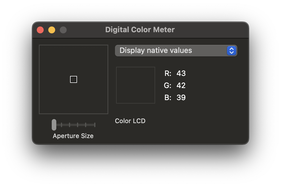
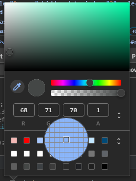
Most color droppers work the same way. If you hover over a color it will give you the red, green, and blue values of the pixel. Past Mac, on the web you can also inspect an element and grab the exact color used by the styles. For example, in Chrome's DevTools, similar tools are embedded. If you find a color in the inspector the color will be highlighted and a square with color will appear next to it. If you click on the on color the color picker and dropper menu will appear. That menu looks like this:
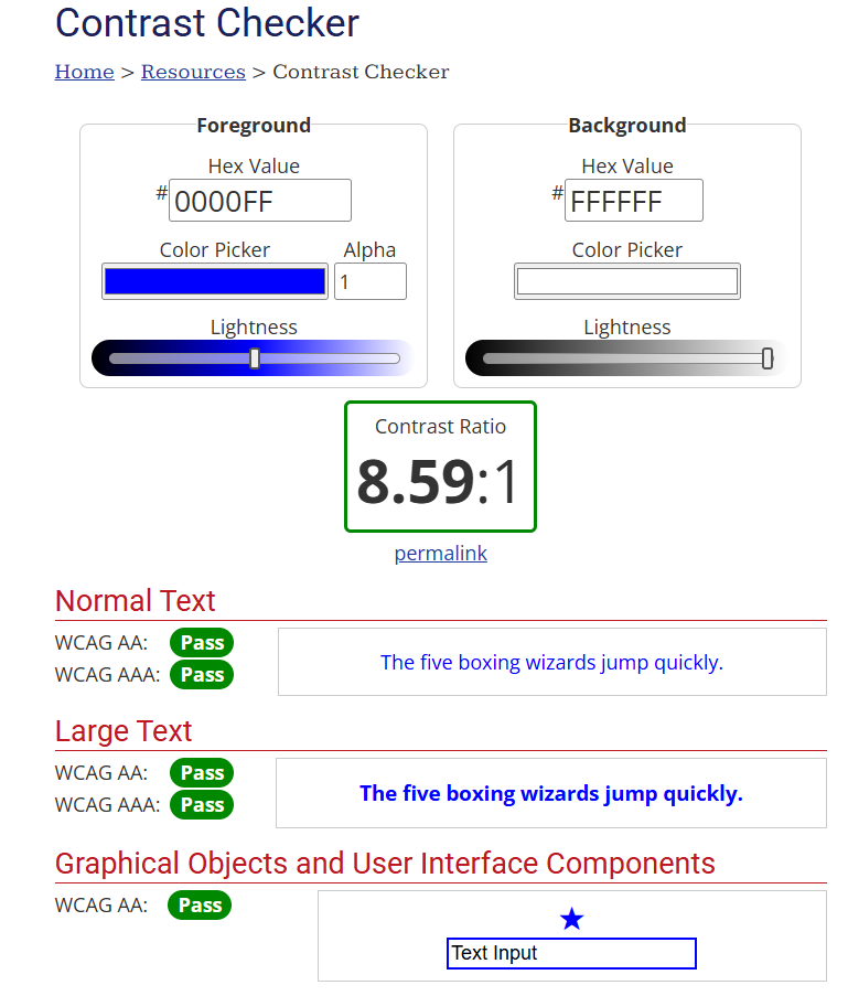
As for calculators, WebAIM provides a contrast checker where you can input two colors and it will output the contrast ratio using rules from a particular standard. WebAIM also checks the contrast ratio against WCAG requirements so it can tell you if the ratio passes or fails under certain guidelines.
Contrast Requirements
The broad purpose behind WCAG's color contrast guidelines is to make sure the text is readable. Whether it succeeds is an interesting question, but it is at least true that poor contrast does negatively impact readability. For example, 1.4.3 Contrast reads as follows:
The visual presentation of text and images has a contrast ratio of at least 4.5:1, except for the following:
- Large Text: Large-scale text and images of large scale text have a ratio of at least 3:1;
- Incidental: Text or images of text that are part of an inactive user interface component, that are pure decoration, that are not visible to anyone, or that are part of a picture that contains significant other visual content, have no contrast requirement.
- Logotypes: Text that is part of a logo or brand name has no contrast requirement.
WCAG requires a contrast ratio of 4.5:1 for text and 3:1 for large text. Remember that it is a hard line and you can not round to 4.5:1. So 4.48:1 is still technically a failure, even if in practice the difference probably does not matter.
There are situations in WCAG that also technically do not require testing. For example, if the colors are for decoration and the text or component contains nothing required to understand your content, you are in the clear. WHen this applies and when it does not is at least partially subjective and this underscores an important aspect of accessibility. Regulations are trying to guide you toward accessible design, but this is an active area of scientific thinking and is hardly perfect.
Another important guideline is WCAG is 1.4.11 Non-text Contrast which reads as follows:
The visual presentation of the following have a contrast ratio of at least 3:1 against adjacent color(s):
- User Interface Components: Visual information required to identify user interface components and states, except for inactive components or where the appearance of the component is determined by the user agent and not modified by the author;
- Graphical Objects: Parts of graphics required to understand the content, except when a particular presentation of graphics is essential to the information being conveyed.
This requirement adds to WCAG that not only text should be tested but also user interface components and other graphics. The idea is that if you are using a user interface, but you made buttons with poor contrast, this could impact the user's ability to read the content or use the application. Again, this might sound trivial. Imagine though that this applies to critical applications. If you cannot use your bank, file your taxes, or sign a legal agreement because you cannot read it, this feels like a problem that should be corrected.
Finally, the requirement for contrast is a ratio of 3:1, which needs to be achieved for adjacent colors. This gets tricky when you have interface components with complex colors. Take a pie chart, for example. To understand a pie chart visually you have to be able to distinguish the colors of the slices. That means that not only does a slice of the piece chart have to have a 3:1 against the background but any adjacent slice should also meet that requirement. As charts scale in complexity and the number of adjacent colors increases, this can get tricky.
Picking Colors
There are a variety of factors to consider when picking color combinations. Text is not always as simple as a background and text color. Sometimes there are outlines and other effects added to text for stylistic reasons. If a text outline impacts the perceived contrast then the outline color can be used when measuring the contrast. A classic example is Closed Captioning in film, which tends to use black outlines and white on the inside.
Remember that in WCAG 2.2, but not 3.0, the contrast ratio given by WCAG is the same even if you swap the background and foreground. Note that WCAG does mention situations where a color is not consistent over a given area. Take a background that has a gradient for example. The background technically has a range of colors that could be considered but the contrast ratio is between only two. In this case it is recommended that you test the area where the contrast is the lowest, but this is again an area with some subjectivity.
Text and components are also sometimes dynamic. They might change color as the user interacts with it. A button might have a hover, focus, and active states. WCAG does not give extra consideration for these, so each state must meet the same requirements and be evaluated independently.
When it comes to graphical objects and other components that provide some sort of information there are some extra considerations. Consider the following icon:

This icon has an exclamation point that is providing information to the user. Maybe an icon like this appears when there is an error. To test an icon like this you need to test multiple colors. The icon itself is against the background so the icon color needs to be tested against the background color. However, the exclamation point is providing information to the user, so that also needs to be tested against the color it is adjacent to.
There is one notable exception here. If the icon is the only information a user receives, then these contrast issues need to be checked. If, however, there were words along with the error, which is usually a good idea anyway, then this is not the case. For example, if the image is for a game and the error has words saying, "the rabbits come at midnight," then the addition of the words is more informative anyway.
Engage
In this example, you will use color testing tools to evaluate a website. The purpose here is not just to evaluate text, but the colors on the site as a whole. For example, if there are user interface elements, graphics (e.g., charts, visualization), or other components, strategically decide which ones to evaluate.
Directions
Follow these directions for the activity:
- Split up into groups and choose a site or tool to represent your group. This may be a homepage for your product or a template for using it.
- Like in previous lessons, swap with another group
- Using the color droppers and contrast calculator of your choice find instances where a contrast requirement might be applied and test the colors. Remember that for regular body text the requirement is 4.5:1 and large text and graphical objects are 3:1. If there are interactive components such as hover states or active states remember to test those colors individually.
- Keep a list of the errors to provide the other group
As a reminder, the purpose of the swapping is to help each other find problems. Even trained accessibility experts make mistakes and some subjectivity is inevitable in work like this. It is not perfect. Your goal is to help the other group find potential problems with accessibility within the spirit of good faith peer review.
Wrap up
Contrast ratios and colors are crucial in product design. Poor contrast decreases readability for almost everyone and is arguably even more serious for many kinds of disabilities. No one is immune, however. Even those with excellent vision, without color blindness or other known challenges, can benefit from good color contrast. Given that accessibility issues often have to be tackled by engineering teams over time, consider what the most important aspects of color on your own products are and where changes should be targeted.
Next Tutorial
In the next tutorial, we will discuss Desktop Screen Reader Practice, which describes practicing with a screen reader on the desktop to get a feel for how they work.