Web Content Accessibility Guidelines Section 1AA and 2AA
Understanding the Web Content Accessibility Guidelines (WCAG) 2.2 AA
Overview
The Web Content Accessibility Guidelines are designed as a set of levels of conformance. One way to think about it is a set of regulations where there is a minimum bar and AA is the current minimum bar in the United States and Europe. Another way to think about it is that this bar gives you design ideas to think about that change slightly at each level. In this lesson, you will move to discussion of the AA standards.
Goals
You have the following goals for this lesson:
- Learn what the Web Content Accessibility Guidelines (WCAG) are
- Learn specifically about 2.2 AA in regard to WCAG
- Learn about the levels of conformance in WCAG
Warm up
Think about the last time a website frustrated you. Consider what you were trying to do on that website. Perhaps you were trying to find something or follow confusing instructions, but there was too much visual clutter or items were too small. Maybe the elements of the page were broken, missing, or out of place. For many people trying to use the web, this frustration can be all too common. When designing an experience for a user, it is important that it is accessible on a technical level, such as providing alt text on images. To be reasonably accessible, a user needs to be able to use, distinguish, and understand the content you want to show them. Consider color for a moment. What causes colors to have sufficient, or not enough, contrast?
Vocabulary
You will be learning about the following vocabulary words:
| Term | Definition |
|---|---|
| Web Content Accessibility Guidelines (WCAG) | A set of standards about how to make content on the web accessible to people with disabilities |
| Luminance | A measure of the perceived brightness of a color and quantified through the luminance equation |
| Color Contrast | Color contrast is a measure, which varies based on the regulatory standard, that compares the colors. In WCAG 2.2, it is calculated through relative luminance. This changes in draft standards like WCAG 3.0. |
Web Content Accessibility Standards
This lesson covers the following standards:
- WCAG 2.2 AA Section 1: Focuses on stronger, clearer, and more nuanced element accessibility than 1A to improve content perceivability.
- WCAG 2.2 AA Section 2: Focuses on improved keyboard and visual navigation and operability beyond 2A by requiring better and more predictable interactions and descriptions.
Explore
Every criterion in the WCAG standard has a level of conformance attached to it that can either be A, AA, or AAA. WCAG is designed to help people with varying levels of abilities, and as you increase the level of conformance, the guidelines start to address issues with usability to be as universal as possible.
Level A addresses some of the needs that must be met to have the most basic level of accessibility. An example of this is adding alt text to images. Without alt text, the image and content in the image would be considered inaccessible because there is no information provided to convey that content to users that need this kind of perception. Without meeting the criteria at Level A, a web page would be considered inaccessible or have a major barrier. To meet Level AA conformance, you must also meet Level A.
Level AA, on the other hand, is where the guidelines address important but more nuanced accessibility barriers. Level AA is the most common target standard for legal and practical compliance. It is a mid-range between the basic necessities for accessibility and the practicality of achieving certain aspects of accessibility. Level AAA is the highest level of conformance WCAG has, which includes some very specific pieces. This level is not the usual target for accessibility because it contains guidelines that are not achievable or practical for certain types of content.
An example of this is the criterion in Level AAA that says to use language at a lower secondary education level. This might not be possible for certain legal or technical content. While using simpler language might be a good goal to aim for, since content may be more understandable at that reading level, it cannot be expected for all content to meet it. Another consideration is that organizations will always try to weigh the cost and effort to implement a requirement and how much users will benefit from it. For example, while having sign language on videos, a AAA requirement, is excellent, a requirement for all possible products would drastically balloon the cost in creating it. It is also not clear it is always necessary, compared to captions, although this is subjective.
While Level AAA might not be the typical legal or practical goal, it does provide interesting ideas, and the improvements to usability for certain people might be significant. The point here is that examining various conformance levels can have value even if you do not meet them all in every context.
Section 1AA: Perceivable
| Guideline | Description |
|---|---|
| 1.2.4 Captions (Live) | If the content is live, captions should also be created in real-time. While not perfect, automated systems have come a long way in creating high-quality real-time captions. |
| 1.2.5 Audio Description (Prerecorded) | A lot like 1.2.3 except instead of the option of having an alternative to the media the audio description is required. |
| 1.3.4 Orientation | Content is not restricted by a single orientation, such as portrait or landscape. Especially important for mobile devices. |
| 1.3.5 Identify Input Purpose | Input fields that require information from the user can be identified. For example you should be able to determine if a field is for a name, address, or other thing from tags on the field such as autocomplete. |
| 1.4.3 Contrast (Minimum) | Unless it’s part of a logo or incidental, text needs to have a 4.5:1 contrast ratio. If the text is large it needs to be 3:1 or greater. |
| 1.4.4 Resize Text | Text should be resizable. Modern web pages do this through responsive design. |
| 1.4.5 Images of Text | Text should be used directly rather than a picture of text. |
| 1.4.10 Reflow | Scrollable content can be shown and used without requiring scrolling in two dimensions. |
| 1.4.11 Non-text Contrast | Color in images should have a 3:1 contrast ratio. This could apply to many things but in some cases such as charts there are fundamental mathematical limitations. |
| 1.4.12 Text Spacing | Changing text style properties should not result in loss of content or functionality. |
| 1.4.13 Content on Hover or Focus | Content that pops up should be dismissable by keyboard and mousing over it and off of it should not cause it to disappear. |
Luminance and Color Contrast
One crucial requirement in Level AA, Section 1 addresses color contrast. Guidelines 1.4.3 Contrast (Minimum) and 1.4.11 Non-text Contrast define a ratio between text color, background color, and color in graphical objects. These criteria aim to address issues distinguishing content on a webpage.
One might imagine color contrast impacts certain people and not others. For example, it is certainly true that contrast can impact those with color blindness. Contrast, however, is easily one of the more universal aspects of accessibility. Poor contrast makes text content hard to read for pretty much everyone. That said, many kinds of users, as they age, with color blindness, or other conditions, can be even more sensitive to issues of color. As a curious and interesting example, consider Rello and Bigham's paper on color contrast [1]. The study is complex and has lots of nuance, but the essential finding is that people with or without dyslexia have different reading performance with different colors, even with the same color contrast. The point is that it is important to think carefully before you presume you understand human perception of color.
Importantly, to understand color contrast, you need to do so mathematically. While it would be nice to do this by feel, the math matters both from a regulatory perspective and from the perspective of understanding what is happening. Specifically, color contrast is calculated through the relative luminance of the colors, which is a measure of the perceived brightness of a color. This is calculated by taking the color and putting it into an equation. In the sRGB color space the equation looks like this:
Looking at the coefficients, it is important to realize that for relative luminance, the amount green in a color affects this calculation more than red or blue. The color contrast ratio is a measure of the difference between two colors. That equation looks as so:
This thus provides a minimum contrast of 1, for example white on white, and a maximum of 21, white on black. A higher contrast ratio would then mean that your eyes have an easier time distinguishing between two colors. But something to notice about this equation is that it does not take into account which color is the background and which is in the foreground. Therefore, you can swap background and foreground, and it would result in the same ratio.
Color Contrast Limitations
Government standards in the U.S. and the EU use WCAG 2.2 as the standard. However, for many reasons relative luminance has its issues. In the current WCAG 3 draft, the color contrast guidelines follow a different model based on modern vision science, and how those equations work is covered in a future lesson [2].
The intentions of the color contrast guidelines are good, but in cases where you might need many colors, such as a chart, there is a fundamental mathematical limitation where there are only so many possible colors you can use that meet the contrast ratio requirements. So while in some cases it might be easy to check color contrast on, like text color and the background, more complicated visual representations might need nuanced consideration.
Consider an example. Suppose you have a chart where you have selected a corresponding regulatory contrast ratio between, say, elements of the bars. If this is so, and such a value is X, then it must be the case that the distinguishing pieces of the visualization, no matter what they are, must be the floor of the maximum contrast divided by the threshold, or 21 / X. In a specific case, if there were 6 bars in a barchart that all needed a threshold of 3, you could have 6 bars. There are many, many ways around issues like this, but the point is that color and color contrast has very real, and very limited, ratios of design play.
There are also other requirements in 1AA that are affected by the responsiveness of the page, such as orientation, text resizing, and the need to scroll to access all content. A key takeaway is that there is a wide range of devices a user might use, and it may not be possible to predict how a user might manipulate the content for their personal use. For example, a user with low vision might increase the text size because larger text may be easier to read. Therefore, from a design perspective, it may be a good idea to assess what happens to your content if the text size is magnified.
Section 2AA: Operable
| Guideline | Description |
|---|---|
| 2.4.5 Multiple Ways | More than one way of finding a web page should be available such as search, links, table of contents, site maps, or other techniques. |
| 2.4.6 Headings and Labels | Content on the page should have headings and labels that describe the topic. Note that this is important but is also very subjective. |
| 2.4.7 Focus Visible | The keyboard focus should be visible on the screen. |
| 2.4.11 Focus Not Obscured (Minimum) (New to 2.2) | Focus should not be entirely hidden by other content. |
| 2.5.7 Dragging Movements (New to 2.2) | Any functionality that uses dragging can be done with a single pointer and without dragging. |
| 2.5.8 Target Size (Minimum) (New to 2.2) | The size of the target for a pointer input is at least 24 by 24 CSS pixels |
Headings and Structure are Critical
At Level A, Section 2 focused on making content keyboard accessible, Level AA builds on this and adds criteria to make content more navigable. While a user is navigating, especially on a keyboard or tablet, it is important they can find where they are and where they can go. Headings and labels help a user understand what they are viewing or focused on. Headings help users move around the page efficiently, especially those using a screen reader. Furthermore, users tend to have a preferred way of finding pages they need, so content with a large number of pages might have a search bar or a table of contents to help find different pages.
Another feature that helps users navigate is a visible focus. You might notice that many controls on the web change appearance when they are active, such as a textbox that highlights when you start typing in it. For sighted keyboard users, this visual indicator is essential for knowing where they are on the page.
Screen readers also draw a focus box around certain objects when they are selected. This makes it important to define bounding boxes correctly, as screen readers may use this information to visually indicate the area of focus. If you are manually controlling accessibility for a user, this also means that the screen dimensions of an item, whether 2D or 3D, need to be known to accessibility through an appropriate property.
Citations
- Luz Rello and Jeffrey P. Bigham. 2017. Good Background Colors for Readers: A Study of People with and without Dyslexia. In Proceedings of the 19th International ACM SIGACCESS Conference on Computers and Accessibility (ASSETS '17). Association for Computing Machinery, New York, NY, USA, 72–80. https://doi.org/10.1145/3132525.3132546
- World Wide Web Consortium. (2023, October 5). Web Content Accessibility Guidelines (WCAG) 2.2. https://www.w3.org/TR/WCAG22/en.wikipedia.org
Engage
In this lesson and previous lessons, you learned about some of the guidelines in WCAG. Now to test your knowledge, you will examine a set of HTML files and try to determine if there are any issues from a WCAG perspective.
Directions
In the first activity, you will explore four separate HTML files, each containing a unique web page. Your goal is to identify accessibility issues in each file, focusing on problems that violate WCAG guidelines or affect general accessibility.
The second activity will ask you to observe a screenshot example to better understand what color contrast means and how it can affect the usability of tools and applications.
These activities are not about fixing the code or contrast (yet), but about building your skills in spotting common accessibility barriers in everyday web content and recognizing where WCAG is not being met.
Activity 1
Open each HTML file one at a time and carefully inspect the structure, content, and design. Use any accessibility knowledge or tools you have learned so far, such as keyboard navigation, meaningful language, or contrast checks, to guide your investigation. If time permits, try to identify at least one accessibility issue per file. Take note of what the problem is, why it matters, and perhaps how you might fix or improve it:
Activity 2
After you have completed examining the files for errors, consider the following image as a teaching example for color contrast:
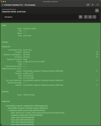
This image is a screenshot, taken at the time of this writing, of the Mac Accessibility Inspector highlighting interface elements. Do the following:
- If you can see the image, discuss the color contrast from this industry strength tool. Is anything wrong?
- If you cannot see the image, the contrast ratios are inside of the alternative description. In this case, discuss the ratios mathematically in terms of their contrast.
Regardless of the method, consider whether Apple's Accessibility Inspector is accessible, from the perspective of color contrast. Whether it is or is not, what might you change?
Wrap up
One interesting note is that the color contrast equations in WCAG 2 and 3 are sufficiently different that you can be in compliance with one, but not the other. Given the regulations will eventually change, consider how you might control your colors in your product. What strategies might you take to make your products permanently in compliance?
Next Tutorial
In the next tutorial, we will discuss WCAG Section 3AA and 4AA, which describes WCAG Section 3AA and 4AA.