Desktop Accessibility Inspectors
Inspectors allow you to manually examine how element accessibility properties appear to assistive technologies.
Overview
In this lesson, you will explore manual accessibility inspection tools that help you evaluate and understand accessibility issues directly from your desktop. These tools, known as accessibility inspectors, help developers by identifying barriers to accessibility and providing insight into how assistive technologies interact with applications. You will learn how to inspect live accessibility data, interpret the accessibility tree, and compare tool behavior across browsers and platforms.
Goals
You have the following goals for this lesson:
- Learn how to use desktop accessibility checkers to inspect applications
- Understand the role of the accessibility tree in assistive technology
- Recognize how browser differences affect accessibility data
Warm up
Imagine you are using an app or navigating a website, and something feels off, maybe a button appears on screen but does not respond as expected, or a label is missing and you are not sure what the control does. In these situations, a desktop accessibility inspector can be incredibly useful. Unlike automated checkers, from a previous lesson, that scan for broad accessibility issues, inspectors let you examine how individual elements expose their accessibility information in real time. Before diving in, consider: what kinds of properties or behaviors would you want to check when something is not working as expected for users relying on assistive technologies?
Vocabulary
You will be learning about the following vocabulary words:
| Term | Definition |
|---|---|
| Accessibility Inspector | A tool that enables you to view and debug the accessibility properties of user interfaces. |
| Mac Accessibility Inspector | A macOS developer tool that lets you examine the accessibility properties of UI elements in apps and webpages. |
| Accessibility Insights for Windows | A tool from Microsoft that helps developers find and fix accessibility issues in Windows applications by inspecting UI elements and running tests. |
| Accessibility Tree | A structured, hierarchical representation of a user interface that is exposed to assistive technologies. It is built from the underlying UI elements and reflects only the parts of the interface that are relevant for accessibility. |
| Switch Control | Assistive technology for anyone with limited mobility. It enables you to interact with a device by activating a switch, such as pressing an external adaptive button, performing a head movement, or making a voiced or voiceless sound. |
Web Content Accessibility Standards
This lesson covers the following standards:
- WCAG 2.2 - 1.3.1 Info and Relationships
- WCAG 2.2 - 2.1.1 Keyboard
- WCAG 2.2 - 2.4.3 Focus Order
- WCAG 2.2 - 2.4.7 Focus Visible
- WCAG 2.2 - 3.3.2 Labels or Instructions
- WCAG 2.2 - 4.1.2 Name, Role, Value
Explore
Accessibility inspectors are tools that can help ensure that applications are usable by different assistive technologies. They often give incredibly helpful information for experts, but are not easy to use. While tools like this are often associated with web content, users do not exist only on the web and this is especially true in software development. Many products are on the web, desktop native apps, or mobile apps, and all of them should be accessible. There are several tools available but the tools you will focus on here are the Mac Accessibility Inspector and Accessibility Insights for Windows.
Windows does have another legacy inspect tool (Windows SDK) that sometimes has more information than Accessibility Insights. This tool is extremely powerful, but unbelievably confusing; and last we checked, it crashes constantly. However, sometimes, it is the only place to get certain information. As such, unless you really need Windows SDK, Accessibility Insights, although less powerful, is arguably much easier to use.
Setup
The inspect tools are not automatically installed into your system so you will have to grab the one for your operating system. For Apple devices you will use the Mac Accessibility Inspector and for Windows you will use Accessibility Insights.
To set up Accessibility Insights:
- Download Accessibility Insights: Go to the official Accessibility Insights website and download the 'For Windows' version.
- Follow the installation prompts and complete the installation process.
- Start Inspecting: Launch the tool and it will open in the live inspect mode so you can immediately start inspecting desktop applications.
To set up Mac Accessibility Inspector:
- Install Xcode: the inspector is part of the Xcode developer tools so you will need to download Xcode from the Mac App Store.
- Enable the Inspector: Open Xcode and then navigate to Xcode > Open Developer Tool > Accessibility Inspector.
- Start Inspecting: Once open, you can start inspecting desktop applications.
Now that an inspector is up and running, the next step is to learn how to interpret what the inspector is trying to tell you. The Mac and Windows interfaces are unique, although they share some common features. You will learn about some of the shared features as well as some of the individual features.
Accessibility Insights
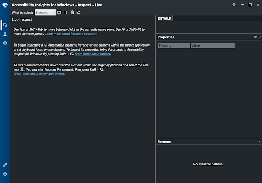
When you open Accessibility Insights for Windows it will open in Inspect mode and there are several UI components to take note of. You will explore a few of them in this lesson.
For example, the Vertical Tab toolbar, the blue-colored bar docked to the left side of the window, contains several navigation buttons:
- Inspect: Selected by default and opens the Live Inspect mode to explore UI elements in real time.
- Test: Access to several automated tests and checklist when inspecting elements. Note that automated tests cannot catch all accessibility problems so much of testing has to be done manually.
- Contrast: Accessibility Insights can also auto detect the color contrast ratio and tell you if the calculated contrast passes the requirements in WCAG 2.2.
- Settings: You can customize keyboard shortcuts here and also login to issue boards to file issues from the inspector.
For this lesson, we will focus on the Inspect Tab and Live Inspect desktop application and see the information provided by the inspector. While the Inspect tab is open Live Inspect mode will be turned on and you will see several panes update and highlight appear as you use other applications. Open the Notepad application to follow along.
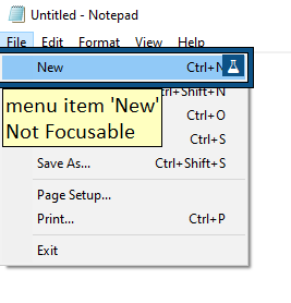
While Accessibility Insights is open you will notice a focus highlight appear around the items you click or navigate to. A box will be drawn around the object, how this box and other properties come from you will see in the properties pane later. A tooltip will appear with the control type of the item, the name of the item, and whether or not the element is keyboard focusable. There is also a beaker icon that may appear on some items that opens the Test tab for that specific element.
After you navigate to an item you want to check, you can go to the Accessibility Insights window and see more information on the element. Note that while in Live Inspect mode you can go to the Accessibility Insights window and the inspector will update with information on Accessibility Insights itself so it is safe to move to that window without worrying about the element being inspected changing.
As you move between elements on an application you will observe that the panels in the Live Inspect window will update. Before we move on it is important to understand that to fully understand the information provided by Accessibility Insights you need to be familiar with Microsoft’s UI Automation (UIA) framework. UIA defines how Windows applications expose different properties to assistive technologies and this lesson will only scratch the surface of the UIA model. To learn more about UIA you can read more about it in its official documentation.
Hierarchy Tree
A prominent feature of the accessibility inspector is the Hierarchy Tree. The Hierarchy Tree is a visual representation of the UIA element tree. This tree reflects how the system organizes the structure of the user interface. Understanding this tree is crucial for understanding how assistive technologies navigate through desktop applications. If you open Notepad and focus on the main text area the tree will look like this:
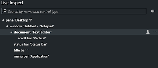
There are two ways to inspect the hierarchy tree and by default Accessibility Insights will be in Control View. Control View is a filtered version of the tree where purely decorative and non-interactive elements are omitted. This view has a focus on what is actually exposed to end users.
The hierarchy from a root element which is often the desktop window. Each node represents a UI element such as a panel or button. Nested elements show parent and child relationships. The order of the elements on the tree also matters as it can reflect reading order and focus order. You can hover over elements in the tree and the focus highlights will appear around the element. Selecting an element will then update the Details Pane which contains more information about the element.
The reason why these structure trees are important is not obvious from the tool. Notably, and this is crucial to understand, the structure can mean different things for different kinds of accessibility devices. A classic example is a switch might have very specific navigation needs, whereas screen readers or Braille devices might have less stringent requirements.
Details Pane
The Details Pane is where you can explore the available accessibility information for a selected element. It is presented as a table and data here tells you about how the element behaves in the UIA system.
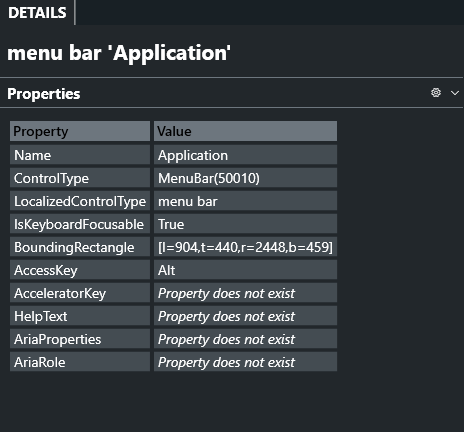
Here is a breakdown of the key accessibility properties that you will find in the Details Pane using the menu bar of Notepad as an example:
| Property | Information |
|---|---|
| Name | The accessible name of the element, announced by screen readers. In this case, it’s Application, describing the menu bar. |
| ControlType | Indicates the UI Automation role of the element. MenuBar (50010) tells us this is a container for top-level menu items like File, Edit, or View. UIA contains a lot of possible roles and you can refer to the full documentation to find the possible values of this property. |
| LocalizedControlType | A human-readable and localized version of the control type, here displayed as ‘menu bar’. |
| IsKeyboardFocusable | Shows whether the element can receive keyboard focus. True means users can navigate to it using the keyboard. In the case of menu bars you typically will not reach them with the Tab key but on Windows the Alt key is how you reach menu bars. |
| BoundingRectangle | Defines the element’s position and dimensions on screen using screen coordinates (left, top, right, bottom). For example, [l=904, t=440, r=2448, b=459] describes a wide, horizontal strip. Screen readers have a feature that will draw a focus highlight around the focused element and the dimensions of that highlight are based on its bounding box. Accessibility Insights also draws a highlight to show the bounds visually. |
| AccessKey | A keyboard key (usually one character) that focuses or activates the element. Here, Alt activates the menu bar. |
| AcceleratorKey | A shortcut key combination that performs the control’s primary action directly. This property is not present in this case. You might find accelerator keys on the menu items attached to this menu bar. |
| HelpText | Additional descriptive text or instructions meant for assistive technologies. Not present here. |
| AriaProperties | Typically used for web-based elements to expose additional ARIA attributes. Not applicable for native desktop applications, so this property does not exist. |
| AriaRole | Indicates the ARIA role for web elements. Also not applicable for native applications. |
This information is easy to buzz by but it is crucial and weird. For example, notice that the ARIA role generally will not have many other attributes. This is because ARIA is a mapping to the UIA element, which is ultimately what accessibility technologies use under the hood on Windows. Further, some elements might seem like they do not matter for certain accessibility technologies, but this assumption should not be made. As a tangible example, a missing bounding box, while in theory a purely visual consideration, is crucially important for accessibility and will break many things if not correct. Point being, if you are examining your application and some of these properties are missing, it might not be a big deal or could be completely game breaking. It takes practice and experience to understand the difference.
Patterns Pane
To represent and categorize the functionality of a control UI Automation uses interfaces known as control patterns. Control Patterns describe the properties, relationships, and methods of a specific piece of functionality for a control. Controls do not need to support only one control pattern and the full set of functionality for a control is typically described with multiple patterns. The Pattern Pane will list the patterns the control uses and you can view the values and available behaviors.
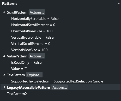
Control patterns describe the interactivity of a control. For example a button might support the Invoke pattern which tells assistive technology that this is a control that can be clicked on and activated. A Scroll pattern is used for controls with scrollable viewports and the pattern would contain information on the direction of scrolling and how far the content is scrolled. There are many different patterns in UIA and you can refer to the official documentation for more patterns and what functionalities they describe.
Again, the above makes it sounds like this is just a property, but at the operating system level it very much so is not. Control patterns give very specific programmatic capabilities to applications at the operating system level and your application will break if these are wrong or implemented poorly. Arguably the hardest to get right are the text related patterns, but many aspects of these patterns can be challenging.
Mac Accessibility Inspector
The Accessibility Inspector on macOS is a tool used to examine the accessibility properties of macOS applications. This tool is provided with Xcode and allows you to audit how applications expose information to the main screen reader on Mac, VoiceOver. While on the Windows Operating System, to understand the accessibility information you need to understand UIA the equivalent API on Mac would be the Accessibility API (AX). To get a greater understanding of the information provided by Accessibility Inspector, you can refer to the Apple Developer documentation for the Accessibility API.
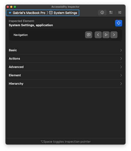
When you open Accessibility Inspector for the first time it will open to the Inspection Tab as shown by the toolbar at the top which has the process being inspected and three different tabs.
You can select where it says ‘All processes’ to choose a specific application to target when inspecting. There are also three tabs that you can navigate between:
- Inspection: This is the default and primary view used for manually exploring accessibility properties of on-screen elements.
- Audit: This tab provides automatic accessibility checks based on Apple’s Human Interface Guidelines and other best practices. Note that automated checks are not perfect and cannot catch all accessibility issues but there are some cases where automated checks can quickly point out issues such as color contrast or missing labels. In short, do not assume that this does what you want.
- Settings: This tab has several options to test certain accessibility options such as inverted colors, increased contrast, or reduced motion.
Inspection
The main tab of the Mac Accessibility Inspector is the Inspection tab. This tab is where you can inspect an element and find its accessibility information.
To inspect an element the inspector does not follow where you are on your device automatically you have to toggle the inspect mode and choose a single element and then the inspector will populate several panes. To inspect an element, there is a toggle button near the top of the window known as the target picker with a crosshair icon which will trigger point inspection mode. You can also use Option + Space to toggle this mode. Your mouse cursor will now change to the inspection pointer and if you were to go to an application such as the built in System Settings app and click on an element with the pointer a green rectangle will be drawn on top of the element matching its bounds.
Although Apple's choice of a green highlight might ruin the color contrast for you and does not appear to meet WCAG color contrast guidelines, it does highlight the bounding box of the element being targeted. Now the inspector will have more panes giving you more information about the element. Note that after you target an element the green highlight is now stuck to your screen and will stay in place even if the application updates or moves. Though the highlight will be removed if you move to a different tab in the inspector or close the window of the inspector temporarily.
When inspecting an element, the main pane in the inspector will update and there are several sub-panes offering information and the ability to trigger certain actions:
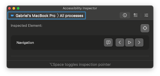
- Navigation: This pane allows you to move through the application and mimic the speech of voiceover:
- The Speak button will speak the element's description the same way VoiceOver will. This allows you to hear what VoiceOver would say when a user focuses the element without having to open and use the screen reader.
- The Previous button moves the target to the element before the current one based on the focus order the inspector can find.
- The Auto Navigate button which looks like a play button will automatically voice the current element and then move to the next one and continue looping through the elements the inspector can find in the focus order.
- The Next button moves the target to the element after the current one based on the focus order the inspector can find.
- Basic: This pane will have only a few of the properties of the element. Properties such as the name of the element given either by the Label or Title and the Value of the element which can tell you about its state.
- Actions: This pane has interactions available for the targeted element. For example a button that can be clicked on will have the press action and there would be a perform button which then does that action. Actions are part of Apple’s AX API and there are several such as press, increment, and decrement along with the ability to define custom actions.These are used by VoiceOver to simulate actions a non screen reader user would do but get the same interaction.
- Advanced: This pane displays more detailed accessibility properties of the currently focused element. The properties shown here vary depending on the selected UI element. When Xcode is installed, clicking on a property name opens the corresponding Apple API documentation. If the documentation does not appear automatically, you can manually search for the property name in the search bar. These properties are part of Apple’s Accessibility (AX) API, and their formal names often begin with 'kAX'. For instance, the Hidden property shown in this pane corresponds to 'kAXHiddenAttribute' in the official documentation. Adding the 'kAX' prefix can help you locate the correct attribute more easily when searching.
- Element: This pane also shows more detailed information but you will usually just see the class of the element and again you can search the documentation for more information on the element’s class.
- Hierarchy: This pane is where you will find the accessibility tree. In the AX API the accessibility tree is made up of AXUIElements. The tree is rooted at the application level and the first child of the application is typically the window the application is in. Nested within the window are the views and elements that make up the application. This is how VoiceOver and other assistive technologies such as Switch Control determine an order to navigate through the application. This tree shows all the accessible objects exposed in the application so if something were to be missing it would be inaccessible to a user using a screen reader or Switch Control.
As one consideration here, consider the actions section. It might be counterintuitive that an accessibility device can take an action, but think about it. If a user has a mobility issue and plugs in a special device that is unique to them, say to avoid using their hands, then it might make sense that a particular sensor or tool could trigger an action like typing or pressing a button. This is one critical reason why accessibility is not just one group. Such APIs tend to be very general and support many different kinds of operations.
Accessibility Inspector also features a settings menu where you toggle certain modes to further test the accessibility of applications:
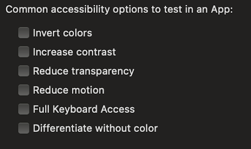
In the settings menu you can toggle certain options such as Invert Colors which flips all the colors on the screen to their complementary colors. So white would become black and black would become white. Assistive technologies might have an Invert Colors option which individuals with low vision might use if they find dark background and light text easier to read. Increase Contrast does something similar but instead of flipping colors the colors are adjusted so darker colors become darker and lighter colors become brighter.
Full Keyboard Access is another option in the settings menu you can toggle. By default MacOS is not fully keyboard accessible. An example is the menu bar always present at the top of the screen. Normally you would have to click on it but to test applications that utilize that menu you can turn Full Keyboard Access and reach all the controls using the tab key and relevant keyboard shortcuts.
Engage
Directions
First, make sure you have the appropriate tools installed on your computer. If you are on Windows try to use ‘Accessibility Insights’. If you are on macOS the developer tools installed with Xcode will include ‘Accessibility Inspector’.
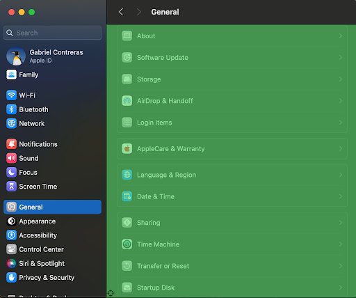
Now you will pick a desktop application to inspect and do so again as a group. While you can use any application on your computer a good starting point to see relatively well implemented accessibility information is the system application that comes with the OS. If you’re on Mac you can inspect the System Preferences application and explore through the menus and controls. For Windows you can also look at the Settings application or another good start could be the File Explorer.
Find a visible interactive element. It could be a button, text field, or checkbox. Use the inspector to explore it in detail. Try to answer the following:
- What is the role of this element?
- What is this element's accessible name?
- Does the name align with any text you see visually?
- Does it have any associated control patterns or actions?
Now to try to navigate through the application from that element. Use the keyboard to mimic how a keyboard user might interact with the application. This time, instead of individual elements you will be focusing on the accessibility tree. As you navigate try to find the following:
- What is the parent of the item you are inspecting?
- Are you navigating through a meaningful grouping, like a dialog or toolbar?
- Are there any sibling items that connect visually but not through the accessibility tree?
- How does the live view of the tree change as you navigate through the application?
- What kind of disabilities do you think the particular structure would have an impact on?
When you are finished moving through the application and viewing the inspector, think about these questions:
- Did you find any elements that were missing entirely from the accessibility tree?
- Was the information shown in the inspector what you expected based on what you saw on the screen?
- Did anything surprise you about how the application was structured? In a good way or a bad way?
Wrap up
Desktop accessibility inspectors are valuable tools for exploring how assistive technologies interact with desktop applications. They reveal important behind-the-scenes information that supports universal design. These tools also allow you to identify and address accessibility issues early, before conducting user testing. Since it can be difficult to recruit users with disabilities for testing, inspectors offer a practical way to evaluate accessibility and simulate possible user-related issues to improve design decisions in advance.
Next Tutorial
In the next tutorial, we will discuss Accessible Hardware Accelerated Graphics (and WebGL), which describes how hardware accelerated graphics have a variety of challenges related to accessibility.