Hour 7: Data Science 2: Accessible Visualization
This lesson is to introduce you to data science.
Overview
One of the most powerful tools in data science is visual representations of information. Historically, visual representations have been limited to the use of alternative descriptions, or colloquially alt text, for accessibility. In this lesson, you will explore accessible visualization, which is a way to automatically generate visualizations that are visual, but that are sent to the computer in such a way that is much more universally designed. You will use these accessible visualizations to understand a data set.
Goals
You have the following goals for this lesson:
- Learn about the kinds of visualizations that are available
- Construct and explore data using accessible charts
- Discuss keyboard controls in the accessible visualizations you have created
- Learn how to customize the appearance of a chart
Warm up
Data visualization is an important tool for conveying information, and it can appear in your everyday lives. What kind of data visualizations have you seen before and where do you find it useful?
Vocabulary
You will be learning about the following vocabulary words:
| Term | Definition |
|---|---|
| Alternative Descriptions | Alternative description describes an image or may provide additional context |
| Charts | A Chart is a graphical representation of data |
| Bar Chart | A Bar Chart is a graphical representation to display categories of data through rectangular bars. Bar Charts can be displayed horizontally and vertically. |
| Boxplot | A Boxplot is a graphical representation of a data set that represents its median, quartile, and potential outliers using box and whiskers. |
| Categorical Data | Data that represents a category where there may be no relation between the categories. For example, 1 might be tacos and 2 cars. |
| Numerical Data | Numerical data is data represented as numbers. This could represent many types of quantitative things, like distance or speed. |
Code
You will be using the following new pieces of code:
| Quorum Code | Code | Explanation |
|---|---|---|
| use Libraries.Interface.Controls.Charts.BarChart | use Libraries.Interface.Controls.Charts.BarChart | A use statement lets you use a type of Object in your program. In this case, you are using the BarChart object. |
| BarChart NAME | BarChart chart | A variable declaration that makes a new BarChart. You can use the assignment operator on bar chart with a DataFrame |
| BoxPlot NAME | BoxPlot chart | A variable declaration that makes a new box plot. |
| DataFrame:AddSelectedFactors(column) | frame:AddSelectedFactors(“Breed Group”) | Selects a column factor from the CSV file into the DataFrame (can be non-numerical values) |
| DataFrame:BarChart() | frame:BarChart() | Creates a bar chart with the selected factors and columns |
| DataFrame:BoxPlot() | frame:BotPlot() | Creates a BoxPlot on the selected factors and columns. |
| SetTitle(title) | chart:SetTitle(“My Chart”) | Sets the title of the bar chart |
| SetYAxisTitle(title) | chart:SetYAxisTitle(“Maximum Life Span”) | Sets the y axis of the bar chart |
| SetXAxisTitle(title) | chart:SetXAxisTitle(“Dog Breed Group”) | Sets the x axis of the bar chart |
| Display() | chart:Display() | Displays the chart |
CSTA Standards
This lesson covers the following standards:
- 3A-DA-11: Create interactive data visualizations using software tools to help others better understand real-world phenomena
- 3A-AP-21: Evaluate and refine computational artifacts to make them more usable and accessible.
- 3A-AP-23: Document design decisions using text, graphics, presentations, and/or demonstrations in the development of complex programs.
Explore
There are many different kinds of data visualizations. While the term visualization is used here, all graphics have the potential to be accessible. Generating a bar or other chart type under the hood knows how to talk to accessibility systems in addition to presenting the chart visually. Just like before, you generate charts with DataFrame objects.
When it comes to describing data, one of the best options to showcase them is visually because people can easily detect patterns and draw conclusions based off of graphs. It provides a visual summary of data rather than having to read and understand blocks of text. From an accessibility standpoint, this still holds. When Quorum generates accessibility information for, say, a chart, you as a human do not need to additionally describe the chart. This makes sense. The computer can just as easily summarize the chart, describe the bars, and such through the math of how the chart is created in the first place. All interactions and descriptions are generated automatically by the programming language without human intervention or description. There are no, so-called, alternative descriptions, because they are not needed. The following chart types are supported:
| Chart | Usage |
|---|---|
| Bar Chart | To compare categorical data or summary statistics from 1+ groups |
| Histogram | To portray sampling distribution with continuous independent variables |
| Line Chart | To depict a single variable or multiple variables with respect to change over time |
| Box Plot | To show the distribution of data of 1+ groups |
| Scatter Plot | To visualize peaks and distributions in numerical data |
| Violin Plot | To determine if two variables have a relationship or correlation |
| Pie Chart | To show frequencies or percentages |
Chart Types
Charts come in many types and are used in the field of data science for different purposes. For example, bar charts visualize quantitative data, so it is important that your variables within your x and y axis take discrete values and can be thought of as labels. Typically one axis should be a label or category and the other should represent something numeric. The numeric value is going to determine the length of each bar.
In contrast, consider box plots, while they also visualize quantitative data, have a different purpose. Box plots often present visually the median and are sometimes called box and whisker plots. The reason is because the whiskers above and below, which represent the quartiles, sometimes look like whiskers. If there are dots above or below the whiskers, which you can see visually but also obtain accessibly, these are outliers.
There are many other kinds of charts and within them there are a great number of features. For example, there are colors, patterns, multi-charts, labels, titles, and even statistics you can embed. In the Parsons problems for this lesson, you will explore a subset of these features.
Chart Accessibility
All charts are accessible by default. All can be navigated with the keyboard and used with accessibility technologies, in addition to being visual. You may refer to the Quorum keyboard controls webpage to find out more general chart hotkeys, but to quickly navigate through the different areas in a bar chart you can use the following keys:
| Action | Keys | Description |
|---|---|---|
| X-Axis Movement | Up Arrow Key | Move to next in sequence |
| X-Axis Movement | Down Arrow Key | Move to previous in sequence |
| X-Axis Movement | Right Arrow Key | Move to next in sequence |
| X-Axis Movement | Left Arrow Key | Move to previous in sequence |
| Value Movement | Page Up | Towards smallest valued point movement |
| Value Movement | Page Down | Towards smallest valued point movement |
| Move into Subgroup | Enter | Move to from a parent to child, for example within a chart to individual bars or pieces of a box plot |
| Move out of Subgroup | SHIFT + ENTER | Move from a child to a parent, for example from bars to the parent chart |
You can navigate with this chart accessible controls. Feel free to test out the navigational controls with a screen reader.
Creating a Bar Chart or Box Plot with DataFrames
While you know how to properly load in a CSV file through a DataFrame, the next step is to use that data to create a bar chart. Before you are able to create the chart, there are additional libraries and objects you will need in order to customize the bar chart.
Libraries.Interface.Controls.Charts.BarChart
Libraries.Interface.Controls.Charts.BoxPlot
BarChart chart
BoxPlot plot
This code adds the BarChart or BoxPlot object which allows you to customize and label your chart to your liking. When you are on your BarChart object in an offline environment, the entire list of options is available to peruse. Online, since the goal is to limit the options to assist in learning, Parsons style problems will allow you to practice using specific actions to manipulate the chart.
Engage
In this section, you will be practicing using a variety of chart types. The purpose in doing this is to highlight how you might create different kinds of accessible visualizations. You will focus on creating charts for different purposes and using customization. Note that these particular problems do not check your answers, in part because they are designed for exploration, but less so to determine an exact answer.
Directions
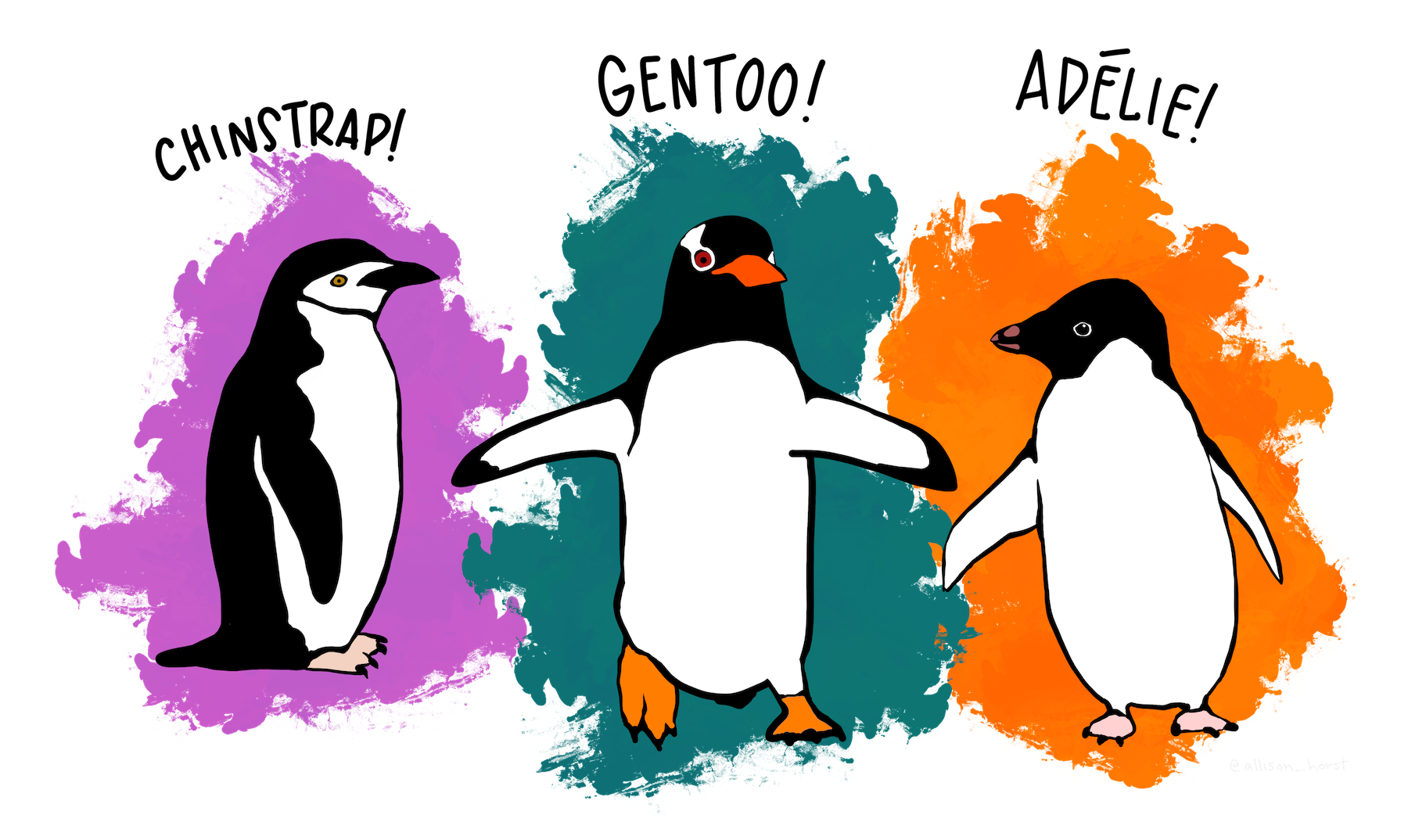
In this activity, you will display information in a way that makes it easier to understand. Using real data can be helpful in thinking about data science, and as such consider the Palmer Penguins dataset , a collection of information about three different species of penguins observed on the islands of the Palmer Archipelago in Antarctica. First, start by downloading the Palmer Penguins dataset. Examine the CSV file, specifically at the column headers in the first row.
The data contains several categorical variables. The species column indicates one of three penguin species, Chinstrap, Gentoo, or Adelie. The island column indicates which of the three islands in the Palmer Archipelago the penguin was found on. The sex column indicates if a penguin was male or female. Finally, the year column indicates what year the measurements were collected for that row of data.
There are also several quantitative measures, or in other words, several values where numbers were measured for each penguin. These include the length and depth of the penguin’s bills in millimeters, the length of their flippers in millimeters, and their body mass weighed in grams.
It’s worth noting that a few entries in the data read NA, especially in the sex column. These are cases where that particular information could not be measured for a particular penguin. There are lots of potential questions you might ask about these penguins, and lots of potential answers you could get from the data.
There is one set of Parsons problems for this lesson. In each case, you can drag and drop, use the keyboard, or even just write in the editor the solution to the problem and run the code. As a reminder, the hotkey to run the code is ALT + SHIFT + R on Windows and CTRL + SHIFT + R on Mac.
Parsons Problems
Wrap up
Visualization, as it is sometimes called, has historically been a visual only area, with alternative descriptions created by a human to replace the visual for accessibility. This works in some cases, but fails to be effective because visualization gets more complicated or adds more dimensions. In this system, however, a visualization automatically generates many alternative descriptions automatically and lets you explore. Unlike some Artificial Intelligence (AI) systems, this does not hallucinate and is guaranteed to be a reflection of the data. Consider as a final activity, what do you think the limits of accessible visualization are?
Next Tutorial
In the next tutorial, we will discuss Loops Online, which describes how to work with loops.